Leo Workwear
A new catelogue design for Leo Workwear
01 | Project Overview
High Visibility. High Performance.
For more than 35 years, LEO Workwear has built a reputation for producing some of the most comprehensive and trusted high-visibility and protective clothing ranges in Europe. As its product portfolio continued to grow, the business required a catalogue that could match the strength of its products while standing out in an increasingly competitive marketplace.
Having partnered with LEO Workwear for many years, Quantock was tasked with reinvigorating the design of its flagship product catalogue. The objective was simple: combine bold, attention-grabbing creativity with a user experience that made product selection and ordering effortless for customers.
The Challenge
With hundreds of products and a significant amount of technical information, the catalogue needed to do much more than showcase garments. It had to communicate compliance standards, product innovations and specifications clearly, while remaining easy to navigate for both new and existing customers.
The scale of the publication added another layer of complexity. Catalogue layouts can quickly become repetitive when dealing with large product ranges, creating a less engaging experience for users. The challenge was to maintain visual interest throughout while ensuring the information remained the hero of every page.

02 | The Straetgy
Designing for Impact and Clarity.
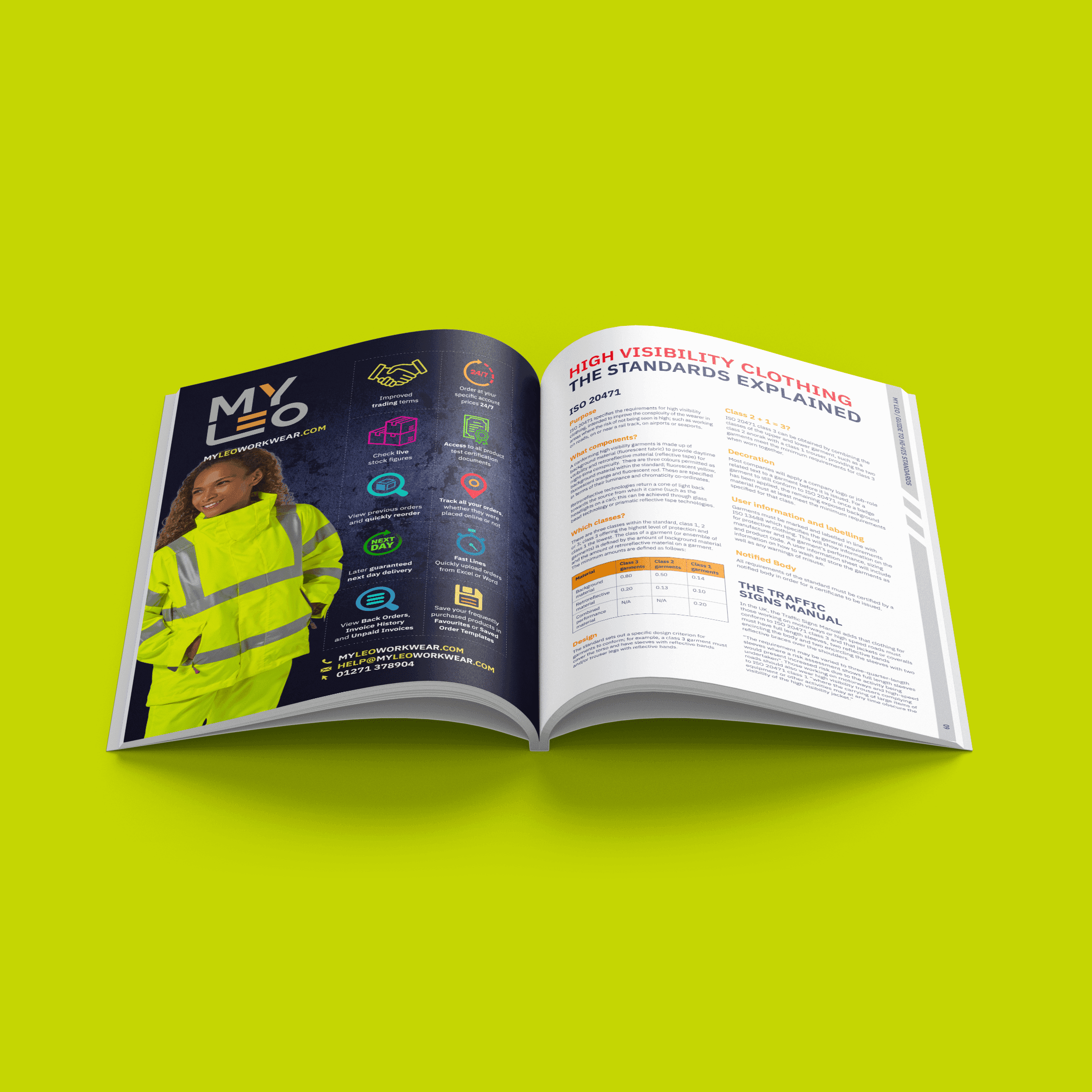
Our approach centred on creating a catalogue that reflected the boldness of the LEO Workwear brand. Drawing inspiration from the garments themselves, we developed a vibrant colour palette paired with clear typography and strong page architecture to ensure information could be absorbed quickly and easily.
To avoid repetition, we carefully designed each spread to showcase products with pride while maintaining consistency throughout the publication. We also introduced double-page section dividers that highlighted new additions to the range, guided users through the catalogue and drew attention to important industry standards and technical innovations.
Every design decision was made with usability in mind. By balancing bold visual communication with intuitive navigation, we created a catalogue that functions as both a powerful marketing asset and an effective sales tool.


03 | The Result
A Catalogue That Works as Hard as the Product
The final result was a striking 170-page product catalogue that successfully combines creativity, functionality and technical communication. The publication delivers a strong presence in a crowded market while making the selection and ordering process simpler for customers.
One of the standout features was the seamless connection between product and brand. The cover design reflected the appearance of LEO's garments, incorporating a reflective chevron pattern and bold luminescent orange colour palette that immediately reinforced the company's high-visibility credentials.
Most importantly, the catalogue demonstrates how thoughtful design can elevate a highly technical publication. By improving clarity, highlighting innovation and creating a more engaging customer experience, the catalogue became a valuable extension of the LEO Workwear brand.

“This project was an opportunity to utilise creative printing techniques, and use colours and finishes that we wouldn’t normally use. We were able to use special florescent pantones and embossing on the cover. We also used metallics, giving the impression of the reflective strips from the protective clothing.
This publication is certainly eye catching – and reflects the high-visibility of the workwear inside.”
Terry Elford, Senior Designer


Leo Workwear
A new catelogue design for Leo Workwear
01 | Project Overview
High Visibility. High Performance.
For more than 35 years, LEO Workwear has built a reputation for producing some of the most comprehensive and trusted high-visibility and protective clothing ranges in Europe. As its product portfolio continued to grow, the business required a catalogue that could match the strength of its products while standing out in an increasingly competitive marketplace.
Having partnered with LEO Workwear for many years, Quantock was tasked with reinvigorating the design of its flagship product catalogue. The objective was simple: combine bold, attention-grabbing creativity with a user experience that made product selection and ordering effortless for customers.
The Challenge
With hundreds of products and a significant amount of technical information, the catalogue needed to do much more than showcase garments. It had to communicate compliance standards, product innovations and specifications clearly, while remaining easy to navigate for both new and existing customers.
The scale of the publication added another layer of complexity. Catalogue layouts can quickly become repetitive when dealing with large product ranges, creating a less engaging experience for users. The challenge was to maintain visual interest throughout while ensuring the information remained the hero of every page.
02 | The Straetgy
Designing for Impact and Clarity.
Our approach centred on creating a catalogue that reflected the boldness of the LEO Workwear brand. Drawing inspiration from the garments themselves, we developed a vibrant colour palette paired with clear typography and strong page architecture to ensure information could be absorbed quickly and easily.
To avoid repetition, we carefully designed each spread to showcase products with pride while maintaining consistency throughout the publication. We also introduced double-page section dividers that highlighted new additions to the range, guided users through the catalogue and drew attention to important industry standards and technical innovations.
Every design decision was made with usability in mind. By balancing bold visual communication with intuitive navigation, we created a catalogue that functions as both a powerful marketing asset and an effective sales tool.
03 | The Result
A Catalogue That Works as Hard as the Product
The final result was a striking 170-page product catalogue that successfully combines creativity, functionality and technical communication. The publication delivers a strong presence in a crowded market while making the selection and ordering process simpler for customers.
One of the standout features was the seamless connection between product and brand. The cover design reflected the appearance of LEO's garments, incorporating a reflective chevron pattern and bold luminescent orange colour palette that immediately reinforced the company's high-visibility credentials.
Most importantly, the catalogue demonstrates how thoughtful design can elevate a highly technical publication. By improving clarity, highlighting innovation and creating a more engaging customer experience, the catalogue became a valuable extension of the LEO Workwear brand.
“This project was an opportunity to utilise creative printing techniques, and use colours and finishes that we wouldn’t normally use. We were able to use special florescent pantones and embossing on the cover. We also used metallics, giving the impression of the reflective strips from the protective clothing.
This publication is certainly eye catching – and reflects the high-visibility of the workwear inside.”
Terry Elford, Senior Designer